A fresh coat of paint for the Ankeri Platform 🚢🎨
A fresh coat of paint for Ankeri UI
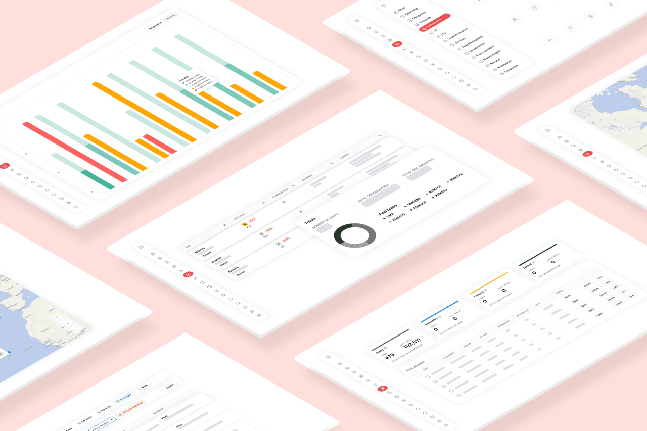
The new Ankeri UI
Quick take: We’re giving the Ankeri Platform a fresh coat of paint —cleaner typography, room to breathe, a clearer visual hierarchy—and we’ve consolidated UI elements across modules so everything feels familiar wherever you are. It’s faster to scan, easier to use, and more Ankeri than ever.
Why change now?
Because great software should feel intuitive on the first click and effortless on the hundredth. Over time the Ankeri Platform's modules have grown powerful—but in some cases a bit different from one another.
This refresh:
- Consolidates UI elements across modules into a shared design system, so patterns are predictable and reusable.
- Sharpens the visual hierarchy, so your eyes go to the right place at the right time.
- Introduces a modern typeface, font scales, and spacing that improve readability and usability.
- Embraces a clean, contemporary look that still feels unmistakably Ankeri.
Think of it like tidying the bridge: same instruments, better layout.
What it means for you as a user of Ankeri
- Less hunting, more doing. Familiar patterns across modules reduce cognitive load.
- Faster comprehension. Better hierarchy + spacing = quicker reads, fewer mistakes.
- A unified feel. Whether you’re in pre-fixture or post-fixture workflows, it all feels like one platform—because it is.
Your data and workflows are right where you expect them—just easier on the eyes.
What’s new (and why we think you’ll like it)
- Unified components across the platform
Buttons, tables, filters, dialogs—the whole toolkit is consistent now. Learn it once, use it everywhere.
- Clearer visual hierarchy
Stronger headlines, calmer body text, and purposeful use of size and weight make long screens feel shorter.
- Modern typeface & typography
A crisp, highly legible type system with balanced letterforms and sensible line lengths.
- More breathing room
We tuned spacing and rhythm so dense data stays dense—but never cramped.
- Intuitive by default
Common actions are closer to your cursor, labels are explicit, and “what happens if I click this?” is easier to predict.
- Brand, but better
The palette and accents draw directly from Ankeri’s colours and logo, creating a cohesive, recognisable experience from login to logout.
A tip of the hat🎩
This redesign wouldn’t exist without our design guru Michael, whose eye for detail and steady creative hand turned sketches into a comprehensive design system which we will be using for the foreseeable future.
Or, without the dedication of our front-end expert Atli Sævar, whose know-how and hard work made everything come together.
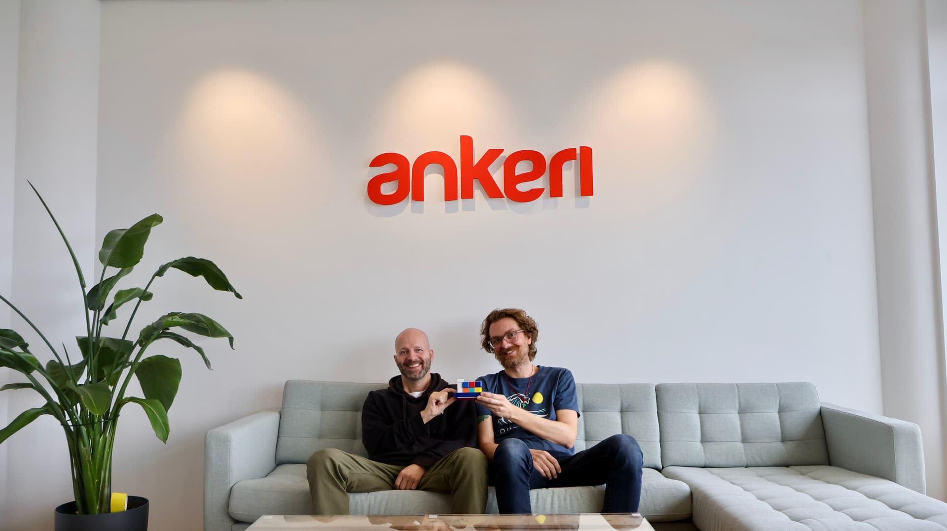
Michael (left) and Atli are happy with the new UI.
We’re not done, and we’d love your feedback
Spot something that could be clearer? Have an idea to smooth a workflow? Then drop us a note at ankeri@ankeri.is - your feedback helps us keep polishing.